
Parcel Guidelines
Documentation of Kinaxis design standards to empower designers and developers to create modern user interfaces.Role/Contributions
Visual Design
Visual Design
Duration/Year
6 months • 2021
6 months • 2021
A single source of truth for designers and developers.
Parcel is Kinaxis’ ever-evolving design system. Parcel allows for both internal and external designers and developers to understand design decisions as RapidResponse heads towards a modern look and feel. Guideline documention clarifies each foundation and component.Solution Overview
I created documentation for major components in Parcel, following a similar format for each one. Each component page highlights the most critical information about that component, including usage, anatomy, specs, special cases (if applicable), and dos and don'ts.Usage
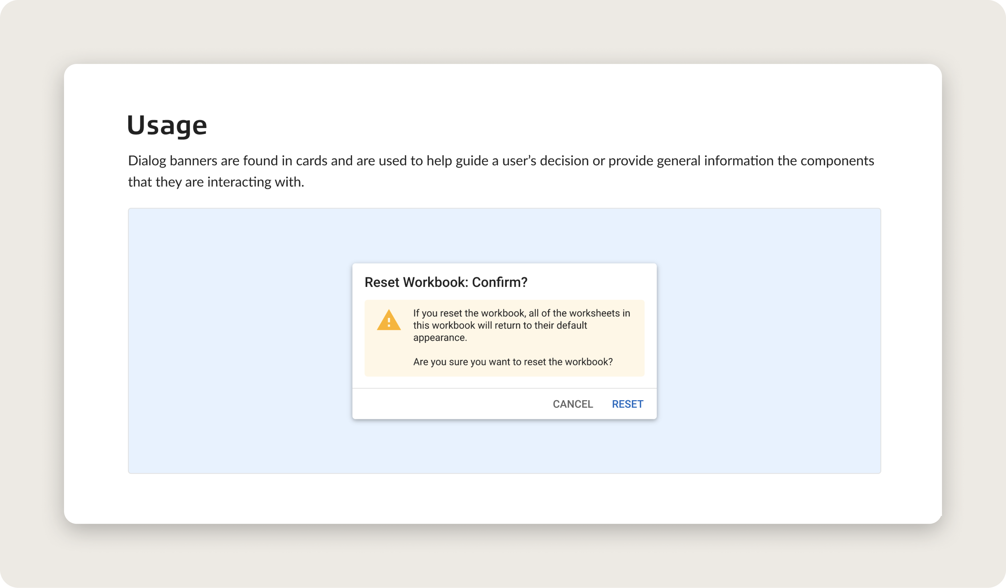
Offers context into where users can expect to see a particular component in the product and why the component might be used. It was important to include this to provide an overview of each component for new adopters.
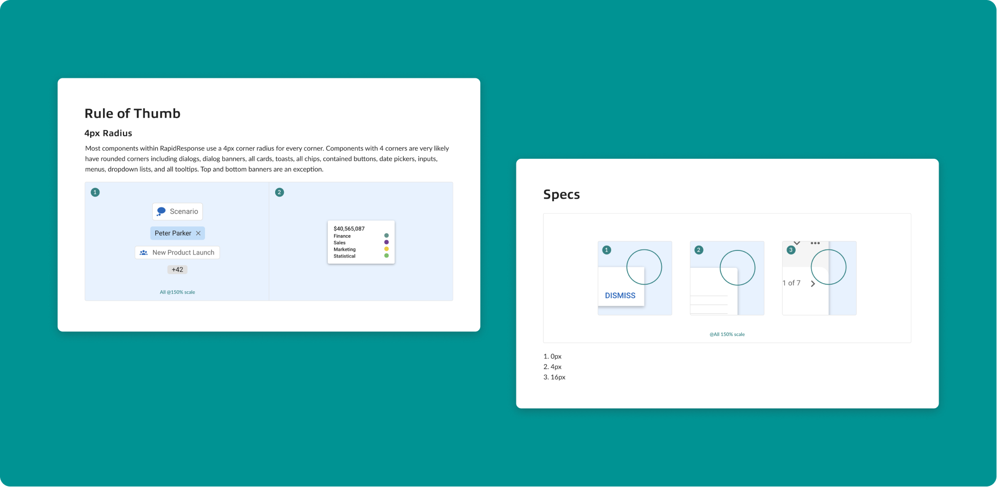
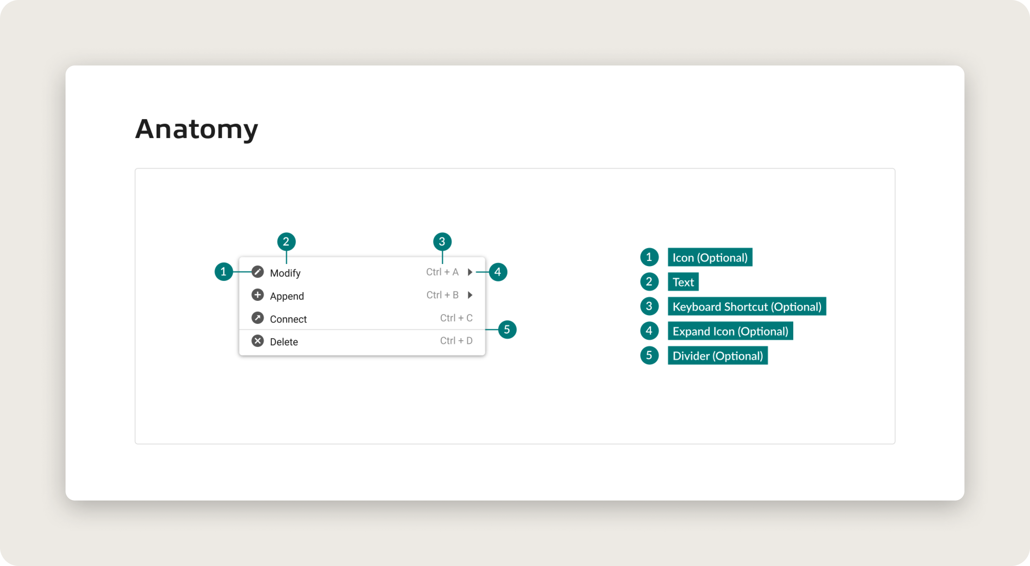
Anatomy
Describes all the parts of a component, including optional elements that could be added based on design needs.
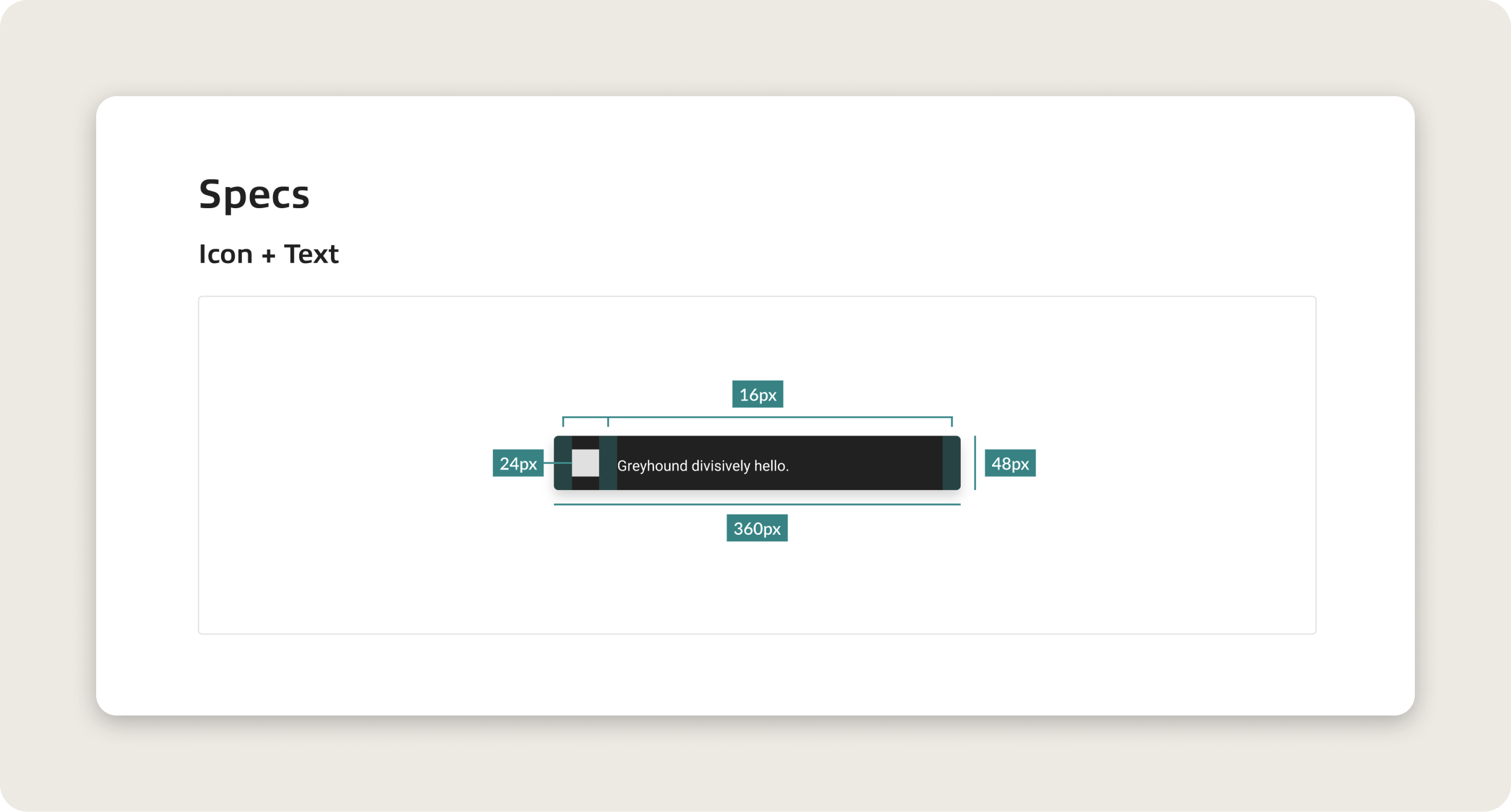
Specs
Specifications for developers to replicate if the component has not yet been built in Storybook, or for external partners to recreate for their needs.
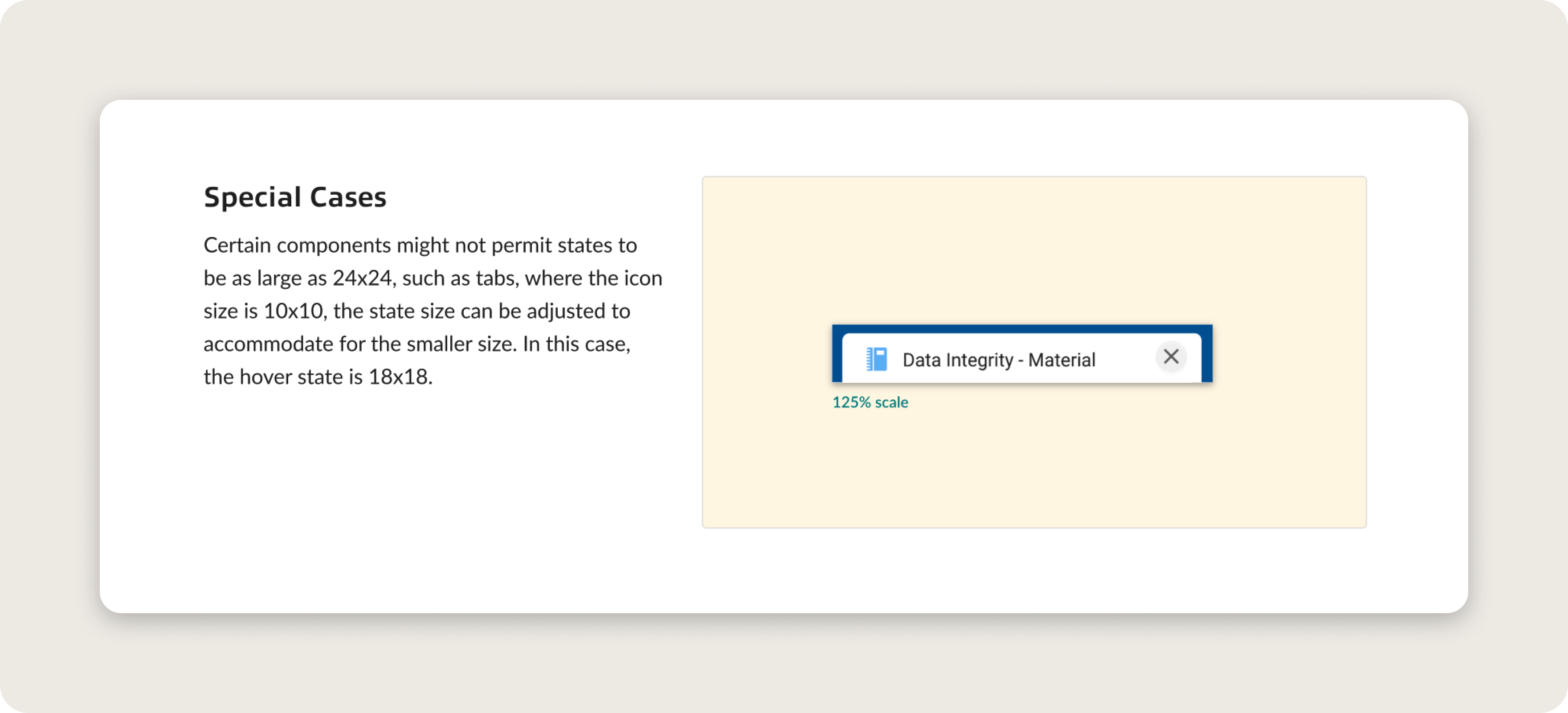
Special Cases
Outlines any outliers that don’t follow the rules of the component. These cases might exist due to specific design needs or restrictions.
Dos and Don’ts
Highlights potential errors that might come from designing with the components.

Impact
Since the release, the guidelines have been a source of truth for designers and developers to understand when to apply components. This applies to both internal and external partners. There’s been particular growth in internal teams that are lead by developers, who have been able to apply Parcel to their products with more design accuracy through the use of these guidelines.
Introduction
It’s one thing to have a design system that lives on Figma for designers and then a collection of UI components on Storybook for developers to know what components can be used, though how do I figure out when to use them? How would I know to use a filled text button over a outlined text button? The “when” is why design system guidelines are critical pieces of information to use along side a design system.
Stakeholders
The three main stakeholders at the beginning of this project were: Internal designers, internal developers (with and without designated design teams), and external partners. With this in mind, it was critical to understand what kind of information was necessary to all three parties.
New internal designers and developers, as well as external partners would need the most time to familiarize themselves with the design system. The question was: what is the best way to display and deliver this information?
Process
I started off by conducting research into existing design guidelines to get an understanding of industry standards.After research, I set three main desired goals for this project.
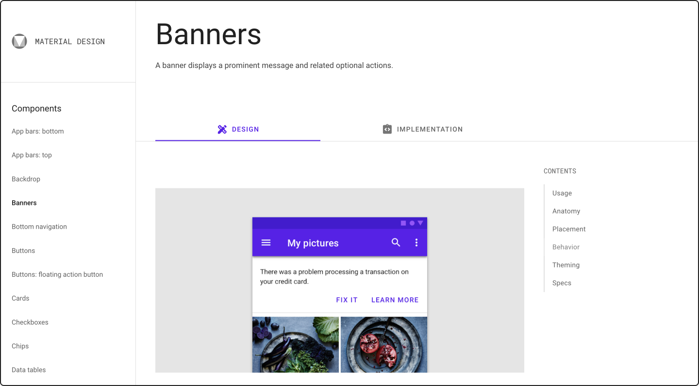 Material Design 2 by Google.
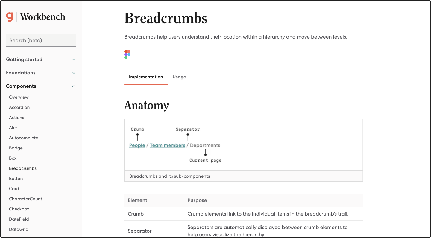
Workbench by Gusto.
Goals for the Guidelines
1
Overview of each component and patterns
Overview of each component and patterns
2
The “do’s/don’ts” of each component
The “do’s/don’ts” of each component
3
Digestible yet informative enough for all parties considered
Digestible yet informative enough for all parties considered
Involvement
I worked with developers to determine the best place to store and share the design guidelines. We considered our audience and decided to host the guidelines on our internal Storybook page, accessible to all Kinaxis employees.
We provide PDF guidelines for external partners who need to replicate Kinaxis' style. Unfortunately, due to security concerns, we cannot share the guidelines in a more interactive format until we have our own Parcel website.

In Storybook, the guidelines sit in their respective component folders. This was organized with developers to ensure that there’s a specific spot where developers and designers can easily find the guidelines.
Final Designs
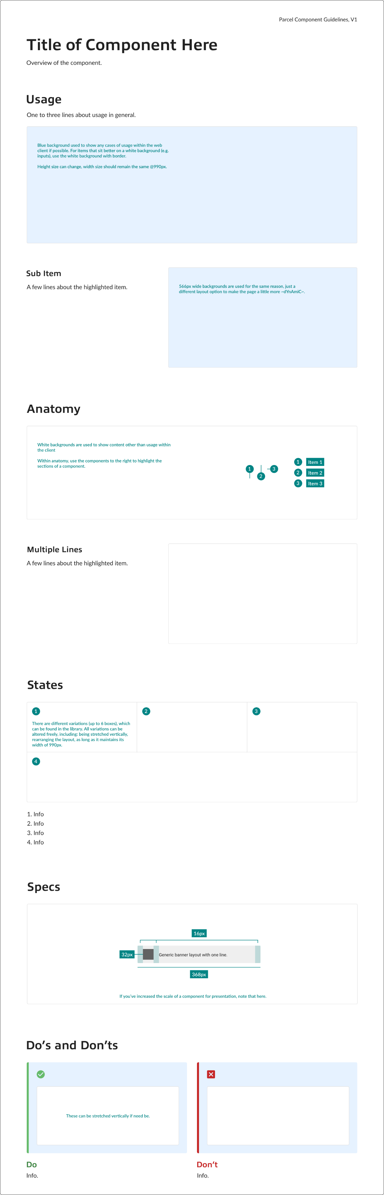
Page Structure Template
I created a template to ensure scalability of this system. Scalability not only applies to when new components get create, but also for other designers on the team to be able to document guidelines.
Identity for the Guidelines
I’m not going to lie, the start of this project was difficult because I struggled to pinpoint an identity for the guidelines. Questions that ran through my head included: Should I just take existing content from the Parcel design system to include? What kind of vibe should I be going for here?
Modern has always been a word tossed around to describe RapidResponse’s new UI. It aims to have a clean and reputable look, which is ultimately what drove my decision making into the identity for the guidelines.
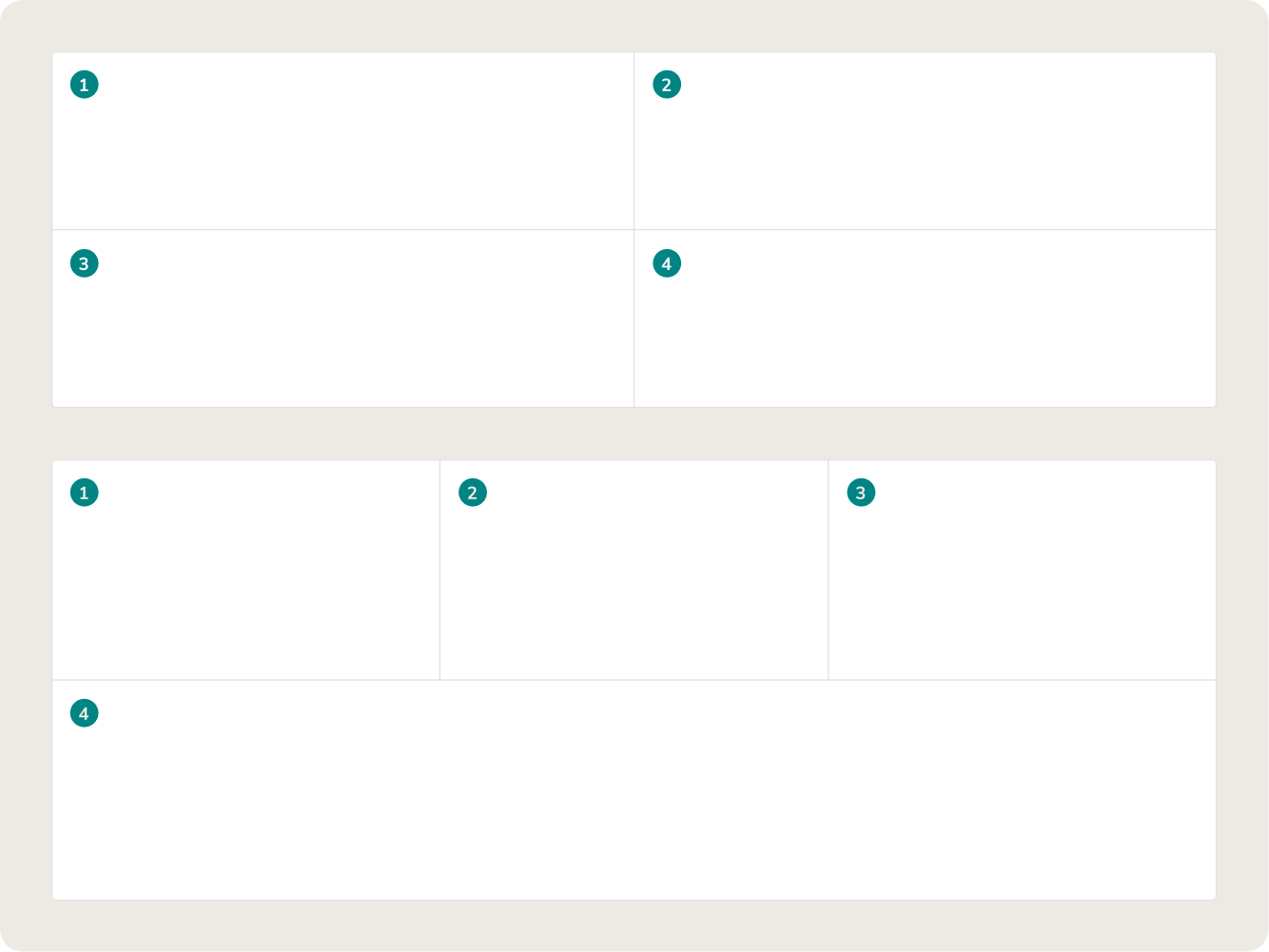 Reusable Containers
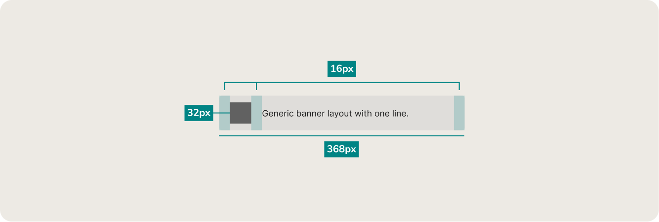 Annotating Size and Spacing
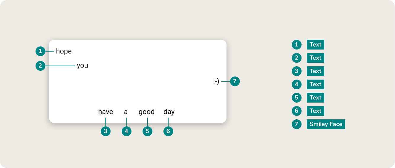 Annotating Anatomy
When considering the audience and goals of the project, it was important to present the information in a simple and clear way. Having annotations that clearly indicate the correct aspect of a component makes it easier and faster for users to understand and digest the content.
Future Vision for the Design Guidelines
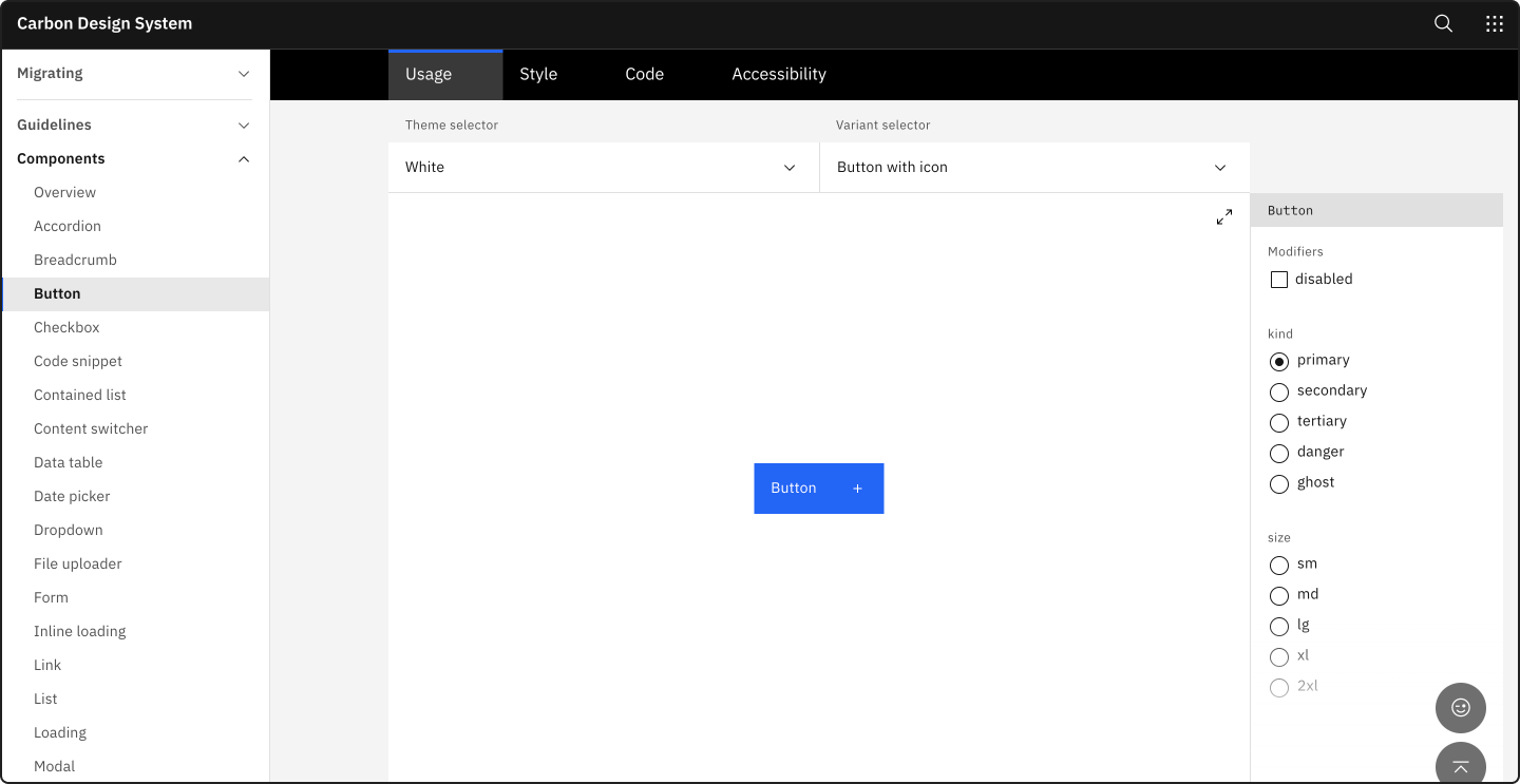
As I researched various design systems, the ones with live demos and interactive elements were more engaging and easier to understand, like IBM’s Carbon Design System. The next step for Parcel would be to outline an approach for a public design system, dedicating a section for live demos on each component page.
What I Learned
I learned that spending time brainstorming the bigger picture before jumping into designs, is important and saves time down the line. Doing all the foundational work at the beginning ensures that there will be consistency and fewer changes as the design process progresses.Overall, it was a great experience spearheading my first major project at Kinaxis. I was able to receive constant and helpful feedback from my team and work closely with developers to ensure the final product could also be known and consumed by the front end team.